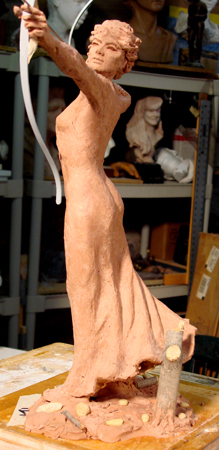
Artemis was commissioned by a company in Columbus, OH, with a different goal and target. The company wanted a confident and attractive—kind of a melting of classical and modern. The company was described as creative, purposeful, passionate, strategic, knowledgeable, flexible, straightforward, independent, challenging the normal boundary standards.
The name and symbol of Artemis was chosen. Zeus’ daughter, divine huntress, held the status and privilege of an Olympian, aloof and free-spirited. Her symbols are the silver bow and arrow.
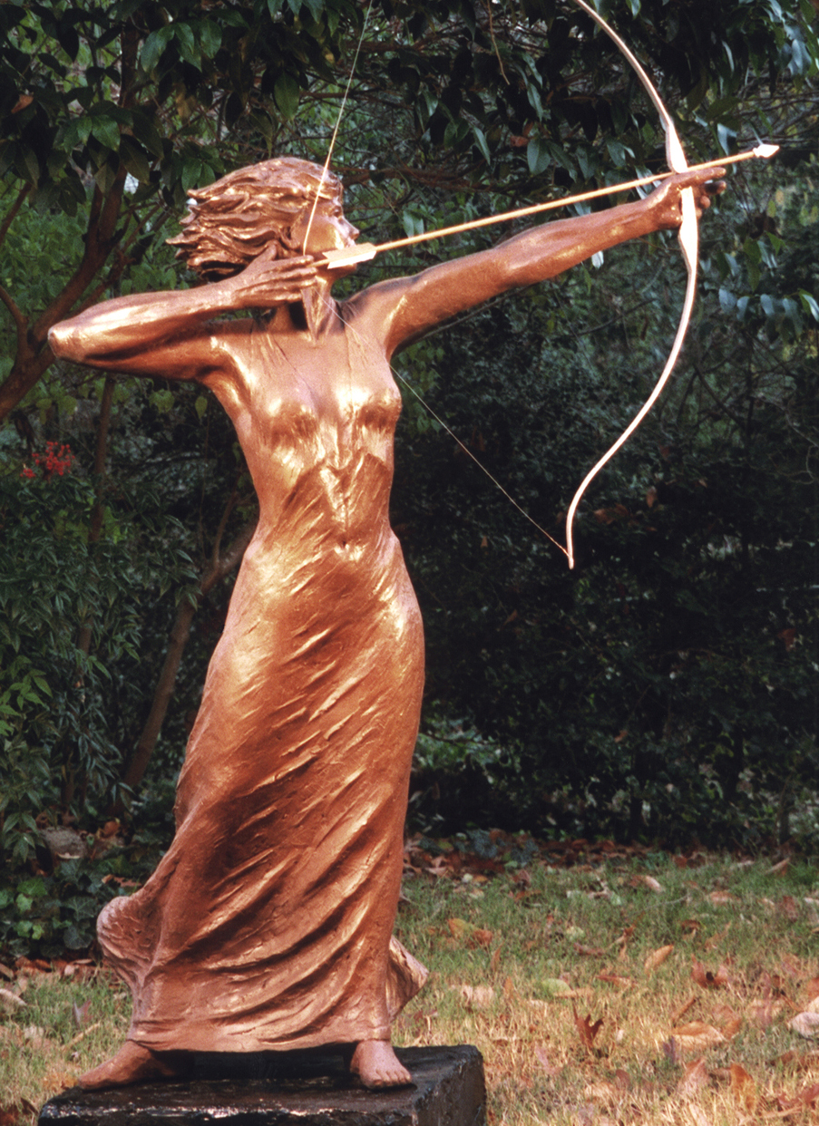
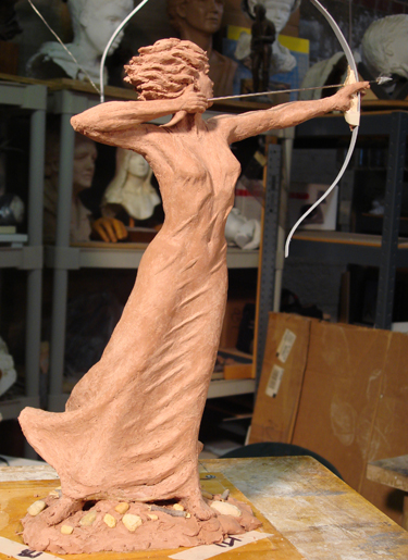
In my design of Artemis I used a draped female figure, slightly elongated body, muscular, graceful, bow poised for a clear shot at target, face and aim slightly upward-skyward but clearly focused on the target. Her back is arched back more for higher focus, but she is flat-footed, well grounded, ready to fire with the silver tip arrow.
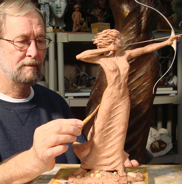
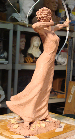
Over the last several years I have been working on a smaller version of Artemis. After some adjustments I have completed the design below and pictured in bronze Here
© Michiel Van der Sommen
